10 Common Paint Misconceptions you can Ignore
Show your truecolourswith no reservations. We asked interiordesigners to dispel the most common myths about paintcolour.
When it comes to painting your home, there are a lot of misconceptions aboutwhich colours make a room look bigger or brighter,rules for trimand ceilingcolours, and how to perfect a palette. But you shouldn’t be afraid of committinga painting faux pas.Interior designers busted the following common mythsabout paint so you can choose colours without any second guesses.
Myth 1: Dark Walls Make a Room Look Smaller
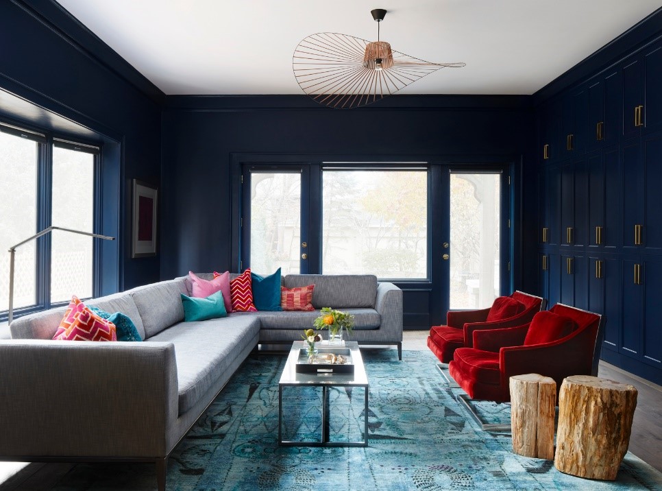
Painting walls and trim the same deepcolourcan make a space feel biggerbecause thecolouritself makes the corners recede.But you have to go all-in andpaint door and window frames, and choosewindow treatmentsthat blend.Consider colours likedeep, coolgrey, green, or navy.They’re rich and make youwant to spend more time in the room. Walls painted a darkcolourwork best inrooms with lots of natural light.
Myth 2: Trim Should Either Be Left As Stained Woodor Painted White

“Colourfultrim often helps a space feel more thought through and immersive,”says designerSusana SimonpietriofChango & Co. “For example, painting all trimto work with a wallpaper accent color rather than white. It’s also a great way tomix colors you happen to love and add whimsy to a space, as is the case with thisroom’s twotones ofblue.”
Myth 3: Vibrant Paint is a Good Way to Brighten aDark Room

With little or no natural light to soften it, a bright wallcolourcan look jarring ina room. Instead,choose lightcolourstinted with white(versus ones toned downwithgrey, which can look shadowy in a dark room). Add multiple light sourcesto create vibrancy.
Myth 4: All White Paints Are Basically the Same

Almost all white paints contain some mixture ofcolouredpigments, whichgive them tone and shading. Unless you go with a pure white paint—whichdoes not work well in all situations.For example, it would be too brilliant in aroom that gets direct sun. Or contrast strongly visually with dark colours
Insteadyou can opt for a warm tone likeTimid Whitewithgolden and blushtendencies, ideal for sunny south-facing rooms; or a Cool Whitefor itssubtlebut distinct blue leanings;andBrilliant Whitethat’sa super neutral with coldundertones.
Myth 5: A White Ceiling Makes a Room Look Larger

“Leaving the ceiling white is a missed opportunity. In thisdining room, wecontrasted the lavender walls with a glossy coffee shade. It adds depth and shineand cuts the sweetness of the wall color,” says Chloe Warner of Redmond AldrichDesign.
“The eye will often ignore a white ceiling. Painting it a complementary shadeadds interest and draws the eye up, creating a feeling of a higher ceiling,” saysGil Walsh of Gil Walsh Interiors.
“Colour on the ceiling can uplift the space, contribute a sense of increased dimension, and add freshness or drama. It also makes the light fixtures pop,” says Barry Goralnick of Barry Goralnick Architecture & Design.
Myth 6: Every Room Should be a Different Colour
A home needs continuity, and using the same color throughout will make your home flow. In this apartment, interiors stylist Eva-Marie Wilken painted most rooms chalky blue for a unified feel, then layered in coral and metallic accents. “I often change accessories, and that works best when there is harmony between them,” she says.
Myth 7: Eggshell is the Best Choice for Paint Finish
Clients think eggshell is the most durable finish. These days, with all of the new paint formulas or the washable finishes, this is no longer true. Sheen is the secret sauce that interior designers often rely on. You can add depth and glow to a space using high gloss.
Myth 8: A Neutral Palettes Means Shades of Beige, Grey, or White

CREDIT: KELSEY HANSEN
Neutral is another way to define softer and calming nuances of colour. Neutrals can be used in interior design in two ways—either as a quiet overall look or as background colours for dramatic accents. Using ‘near neutrals’ creates a low enough intensity to not be considered a real colour.
Using lavender with a greyer undertone in a bedroom, for example, creates a calming, elegant space with cream and white accents,” says Philip Mitchell of Philip Mitchell Design.
Myth 9: There’s No Need to Prime Walls if You’re Using a Dark Colour
Regardless of how light or dark the hues are, your existing wall colour can affect how the new paint looks, so the final effect might not be true to the colour you picked.
“Think about painting a room dark green when the wall colour was lavender,” says Jean Liu of Jean Liu Design. Essentially, the shade of green will be tainted by the lavender. We recommend two coats of primer and two coats of paint to achieve the true colour.”
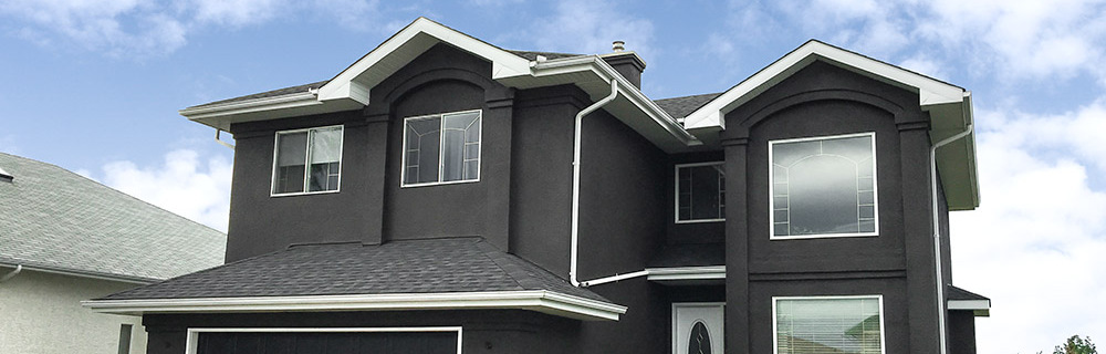
Myth 10: All the Walls in a Room Should be the Same Colour

CREDIT: AMORFO
Another wall colour not only captures the attention, but helps define a separate zone in a room without a divider. It can also be used to add contrast and highlight an architectural feature like a fireplace or special room shape.
That’s just what designer Lauren Li of Sisällä did in this living room, where a dramatic blue-black accent wall showcases the converted barn’s architecture. Li chose an inky black similar to PPG Witchcraft for a deeper take on the home’s slate flagstone facade.
Blog prepared by Pakariwha Limited with content from Better Homes & Gardens
 Next Post